There is no design evil enough that not some braindead joke of a person will step up and fight for their favorite company… I really can understand thanos these days.
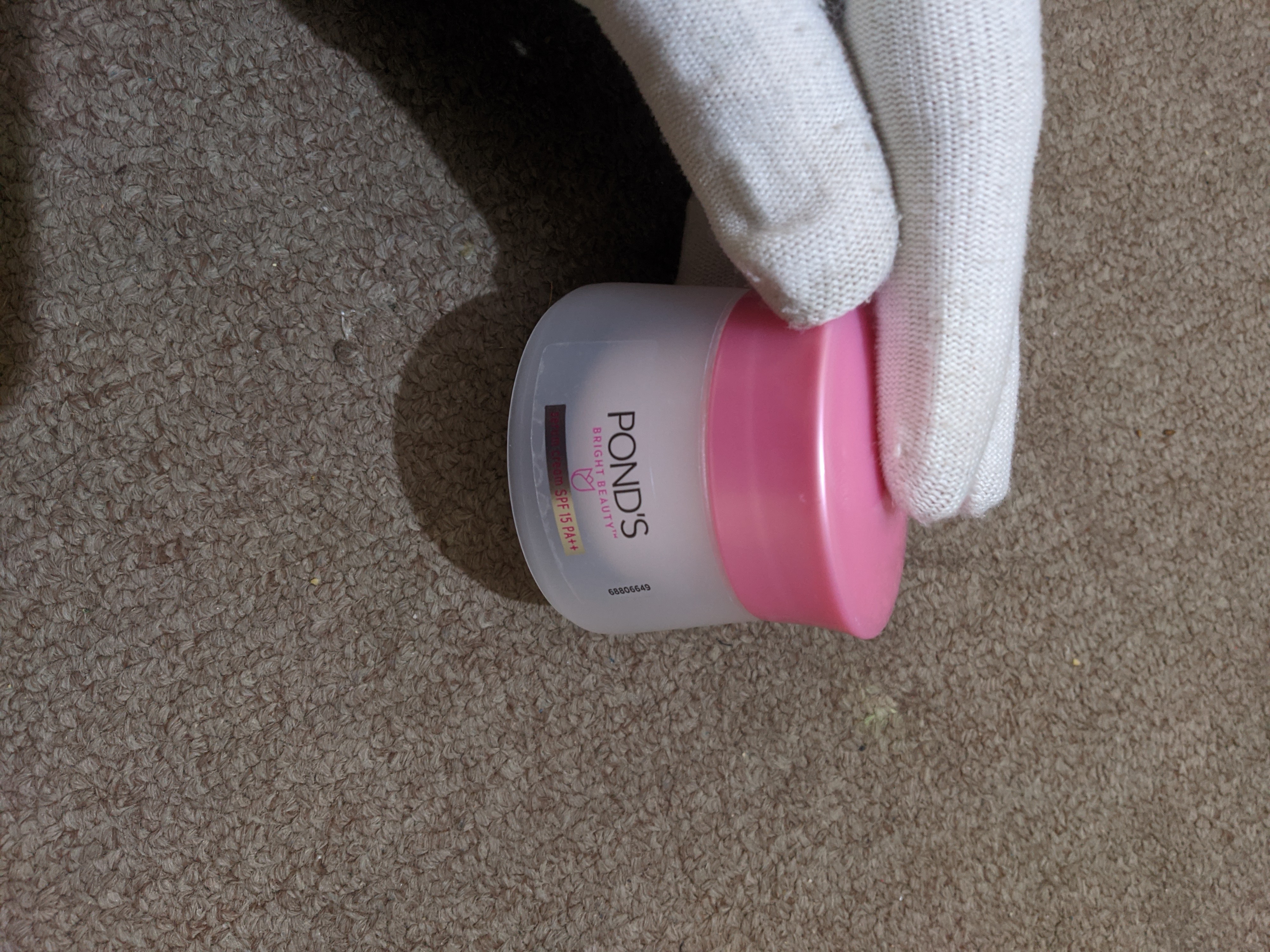
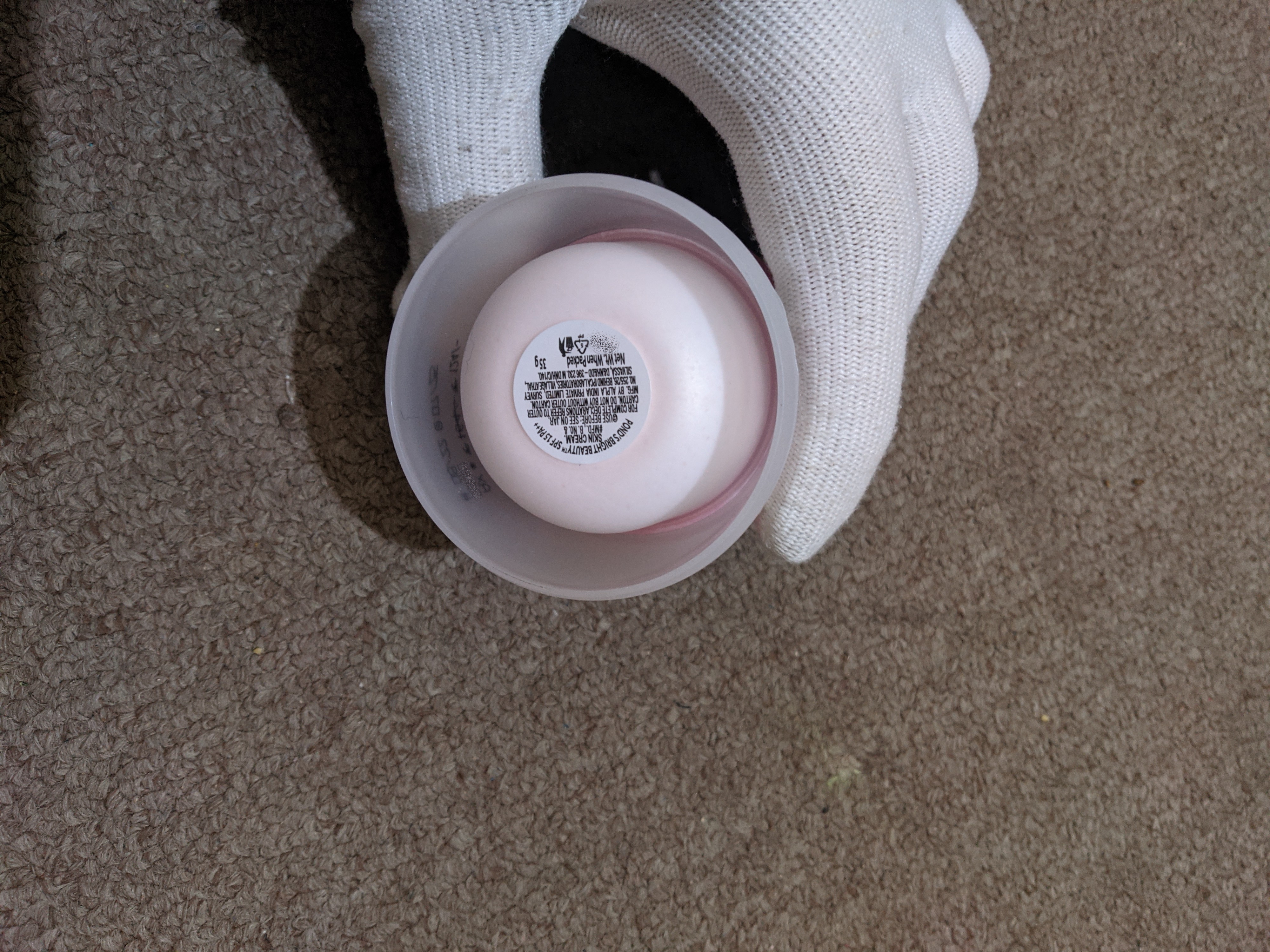
Dont really see how this is asshole design, from the front its visible where the cream is in the jar?. When buying and lifting it, volume or weight is visible and you can turn it over to check. Nothing was hidden.
but as the cream came in a cardboard box, I couldn’t have guessed that it’d be so small.
Then the design of the bottle couldnt have an influence on your purchase decision either.
yes it could have, the increased bottle size would require a larger box
If this design really isn’t asshole design, then why are they still doing it like this? It’s pretty obviously supposed to look like it has more content than it does rn; and even if you do realize what’s going on, this makes it way harder to guess the amount of the contents. A number for gram amount is ok, but your brain really guesses by looking at the content, not the number.
Did you take this on your floor? And why gloves?
Not sure about the floor, but wearing gloves helps limit how much moisturizer evaporates vs gets absorbed into the skin. For really dry skin, using lotion or cream before bed, then wearing gloves while you sleep can be very helpful.
yes, I took it whilst sitting on the floor.
As for the gloves, it was quite cold at the time.