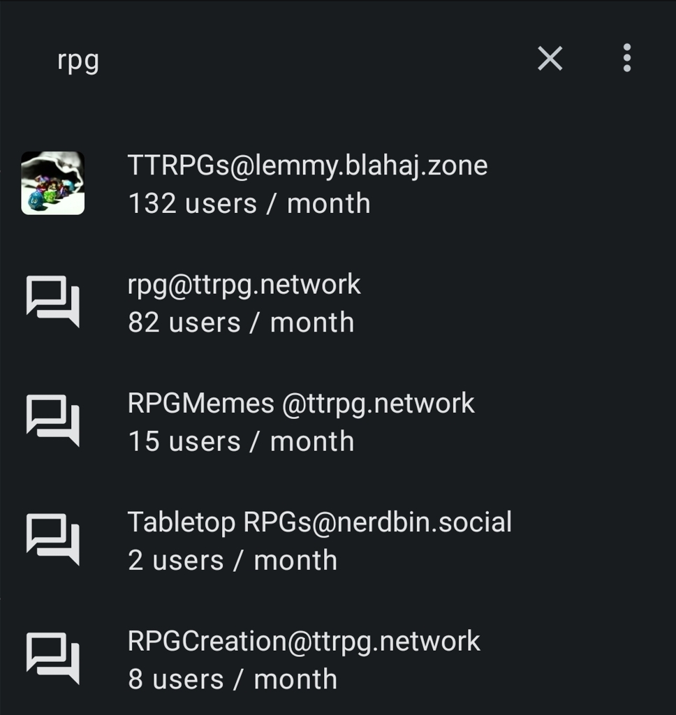
I’ve noticed as a mobile user (jerboa, liftoff etc) when searching for and using communities in this instance they don’t have an image representing the community like most others do, just a blank space. I believe adding these would help with discoverability/readability, assuming its not a problem just on my end.


I see them in wefwef and Jerboa.
Here’s what they look like for me on Jerboa: