
Edit: I posted the first release of my theme based on the ideas in this post here!
Hi everyone!
I’m an Industrial/Product Designer in my professional life, and I was so inspired by @UrLogicFails’s fantastic new community icons that I wanted to try out some of my own design ideas for Beehaw.

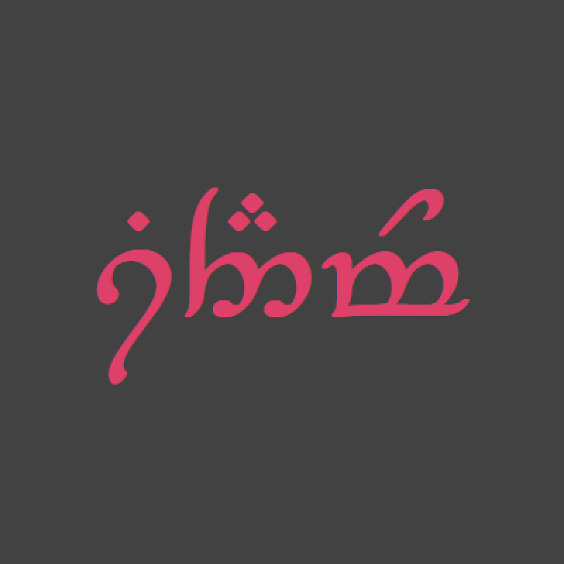
First, I tried my hand at an icon for Beehaw. I’m endeared to the little pixelated bee-cowboy we have now, but my background is in cleaner, more minimal designs that are easy to deploy to lots of different devices. A good logo sets a good first impression, and I want new users to see Beehaw as a real, legitimate alternative vision for social media. I’ve tried to recreate the back of a bee, and used the wings to form a subtle letter “B.” My personal favorite is the hexagon bestagon, but I have both iOS and Android variations. Icon design is always really contentious, but it’s also really fun - I’d love to see other people’s ideas!
Second, I took a stab at tweaking the design of Beehaw, with the goals improving the layout and padding, introducing a more consistent color scheme, increasing legibility, and (of course) incorporating more bee elements. I’m working on a CSS theme that incorporates some of these changes, but others are beyond the scope of CSS injections and will require actual work on Lemmy-UI.
Light Theme:


Dark Theme:


I’d love to hear your thoughts, and I’m happy to share more if people are interested :)
Thanks for viewing, take care!
Hey there. This is beautiful work!
I can’t speak for all the other admins but I have strong opinions on the logo. To me, the logo needs to be both bee and haw and I don’t want it to feel watered down or presented in a way to be appealing to all the masses. To me it’s meant to be cute, radical, and kinda in your face with it’s absurdity. I don’t think it can be done in such an abstract way without losing too much character. But that’s just my 2c.
The themes are quite clean, however, which is definitely what I think we need to reduce visual clutter and make things easy to find. Thank you so much for putting this all together, it’s great work!
Thank you for the kind words! I agree, I said in another comment but this is all “bee” and no “haw” in a way I figured wouldn’t quite fit the feeling of the site. My design practice is unfortunately so “commercial” that it’s hard to get my preconceived notions of icon design out of my head. Balancing approachability and character is tough! If I do another round, I’m gonna somehow get a cowboy hat in there haha
No offense to you personally, but I really don’t like that kind of logo design. I feel it lacks personality and uniqueness. I’ve seen an awful lot of companies redo their logos along those lines and they were almost invariably worse than the original. I look forward to this trend coming to an end.
Using hexagonal shapes and yellows for UI elements is certainly fitting, though.
aa
Beautiful work! All the other admins will be waking up soon and, I’m sure, will want to discuss.
Looks wonderful! I would certainly use the dark theme version if it was made available here on beehaw. 👍👌
If you’d still like to try the dark theme, I just released a theme based on this post! Would love to hear your feedback :)
deleted by creator
Love this feedback, thank you! It’s a really interesting exercise, trying to make something that isn’t professional - I’ve worked so long in our modern “clean and simple” landscape that it’s tough to remember when I was younger, and things were more wholesome, simple, and authentic. I agree, for a site that is by definition “alternative,” these logos are a bit too corporate looking. Glad you like the theme though!
deleted by creator
Hey there! If you’re still interested in trying it, I just released a theme based on this post!
deleted by creator
Just to pile on with everyone else, but I really love the themes, especially the dark one!
I just released a theme based on this post if you’d like to try it!


