- cross-posted to:
- games@sh.itjust.works
- cross-posted to:
- games@sh.itjust.works
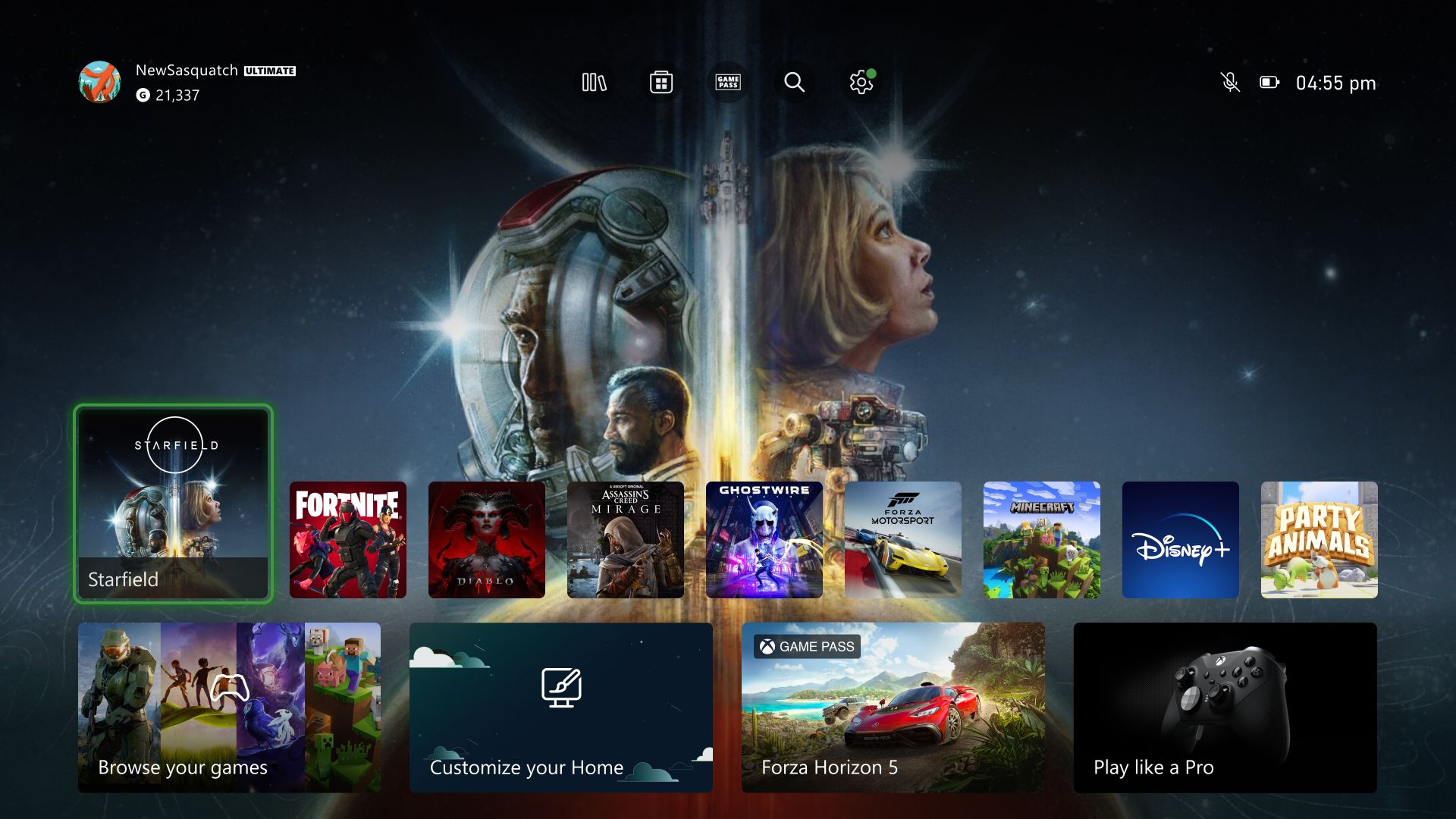
Starting today, a new Home experience is rolling out to all Xbox Series X|S and Xbox One consoles.
Wish you could hide that entire bottom row, but otherwise it looks pretty good.
deleted by creator
Xbox needs to delete the entire Ad row. It will instantly create a vastly more enjoyable Home screen and starup experience with literally no other changes needed.
Well it can’t get any worse
Truth, I haven’t turned on my x since the first month and I don’t know why we have it
You just need to find your game!
Finally. I’m glad. I’m tired of having my background be completely covered up. It needed a refresh, I can’t wait to get it!
How many dashboard updates does this make in the last ten years?
I play my Series X all of the time and I think I’m very much in the minority when I say this couldn’t matter less to me.
Until you have to navigate it. I’m dreading it RN. Hopefully it’s better than it currently looks.
Another swing and a miss. When was the last time Microsoft changed something for the better? Windows 7, maybe? Its been a while.
Legit the biggest downgrade Xbox got in the last 10 years. Cluttered with shit, quick resume not on the first page, not sortable… Who the hell designed this? New to gamepass is on the first page, while leaving soon is on the last page.
The design looks like somebody looked at FireTv and thought that is one clusterfuck of an UI. I can top that!
Also what is up with entertainment? Why is one entire page and one subsection dedicated to entertainment. I haven’t downloaded or opened an entertainment app in years on Xbox.
With this Xbox is now sadly behind PS on the UI front and PS has one fucked up UI. The sad part while not super sophisticated, the old UI was actual quite good. You could tailor it to your needs and it looked like it was designed by someone who had an idea what he was doing.
Also Xbox live the new way to get to that is also horrendous. Yeah you are going to remove it but it is still a feature today….
I hate the fact that we lost the ability to customize and have a variety of groups in different orders now.
This is the most unforgivable change for me. I basically don’t even use the dashboard any more because I never know where the things I care about will be. I’ve switched almost entirely to the “X jewel” menu instead.
Just booted up my Xbox and saw the update was already installed. I had to go back into the Games/Apps menu to add my groups back to the home screen.
Here I am waiting for the update. Womp
It was in an update from few days ago. They are just turning the switch now.
I like the update
Terrible. We use ours firstly for entertainment apps, so having a row for ‘most popular games’ before the group with the apps is rubbish. I honestly don’t care what others play. Wish we could customise it. I can see us shelving the whole console and using a Roku for watching instead, because it’s that bad. I’m dreading having to explain to the fam how to use it, again.
As for the games we do play, it’s now so much harder to get to them. Fail on that front too. It’s literally a giant ad now, getting rapidly worse as we scroll down.
I hate how much ads are there, more so for the stupid game pass. I’m already a subscriber too, I don’t need the constant spam damn!
Looks like they ripped off the ps5 menu quite a bit.

