

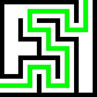
I regret not posting it before Canvas 2025, but hopefully it’ll be useful for people playing it in 2026. All letters are 5 pixels tall, and most 3 pixels wide (some 4, a few 5). I’ve also included a few Cyrillic letters and the digits.
I tried to make it even smaller, but it gets really funky.
As an alternative, the 8-bit world has been doing this for a very … long … time.
Do you have some good examples of that? The more, the merrier - it might help people to get ideas.
There’s hundreds, here’s a few tiny ones:
- https://luc.devroye.org/fonts-51468.html
- https://web.archive.org/web/20250514212230/https://robey.lag.net/2010/01/23/tiny-monospace-font.html
- https://moonbench.xyz/projects/tiny-pixel-art-fonts/
- https://littlelimit.net/misaki.htm
- https://zserge.com/posts/tiny-font/
Example of discussion on the topic:
This is amazing - thank you!
That’s a great list, thank you! I love small fonts.
I didn’t read the post and took longer than it should have to realize that the bottom half-ish are non-Roman. (Numbers are Arabic! So half!)
I… speak Russian tho (badly, non-fluently), so I should have known…
What is the character between
<>and¡?You mean Ø? I accidentally inverted it, but it should be easy for people to flip it. Here’s a full list of what I’ve tried to represent:
ABCDEFGHIJ
LMNOPQRST
UVXYZ!?.,"«»
ØİKWYÐÞŁ
БГДЖЗИЛПЦ
ШЩЬЮЯФ
1234567890
I hate how Щ looks
If you don’t mind having a few six pixels tall letters:

Ш (for reference), Щ, Ц (same problem as Щ), and У (it’s weird to use Y in its place, but I kind of forgot to add it).
Of course, this will depend on space, plus personal style. I’m not claiming this is the only way to do things, it’s just a viable “font” for people struggling with text in the canvas to use as starting point.
(I actually use a similar strategy with diacritics in the Latin alphabet. Specially ⟨Ç⟩.)
I didn’t notice Ц in the original post, I thought it’s Ч
I didn’t include Ч because it’s easy to sub it with 4, Volapuk style.
Counter argument: This is just one style and the canvas looks better with a mix.
Many of the letters can be made a pixel slimmer, can already make a huge difference to a final look.
Sometimes it also matters what letters you actually need.
Counter argument
What argument are you exactly trying to “counter”?
Its more of a warning for over relying on established systems.
The more people experiment and make mistakes the more chance someone ends up with unique cool.
Ah, that’s OK.
As I mentioned in another comment, I’m aware this is not the “only” way to do things. It’s more like a starting point - 5x3 letters look decent enough, they’re easy to distinguish, and even for the same size you can twist things up a bit (like adding a few pixels to ⟨A⟩, or making the ⟨8⟩ only seven pixels in total).
For example if you have less space you could make most letters 2x3 or 3x2, but it’ll look messy.
deleted by creator
deleted by creator
