

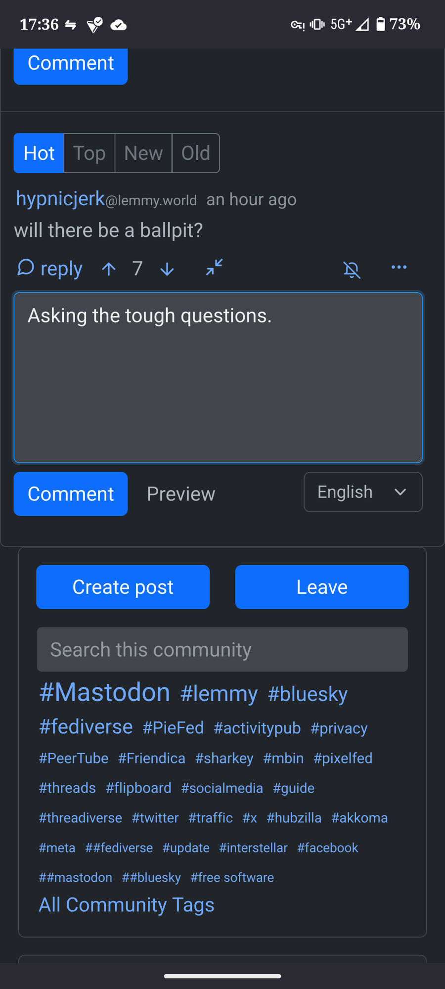
On the mobile page. I’m right handed and meant to comment, but the Leave button was blie and right under tge box I was typing and was blue and I didn’t even read the Leave and you guessed it, I left.
Suggestion would be to make the Leave button a different color like red? Or move? Idk. :-). Just a thought could just be I’m a silly.
Not a bad suggestion. When you are browsing the
/communitiespage for example, the leave buttons are in thewarningcolor (yellow if you are using the default dark theme) while the join buttons are in theprimarycolor (blue). I can try to whip up some code for this.We could do with more vertical space between them too.
Sounds good!