
- cross-posted to:
- hackernews@lemmy.bestiver.se
- cross-posted to:
- hackernews@lemmy.bestiver.se
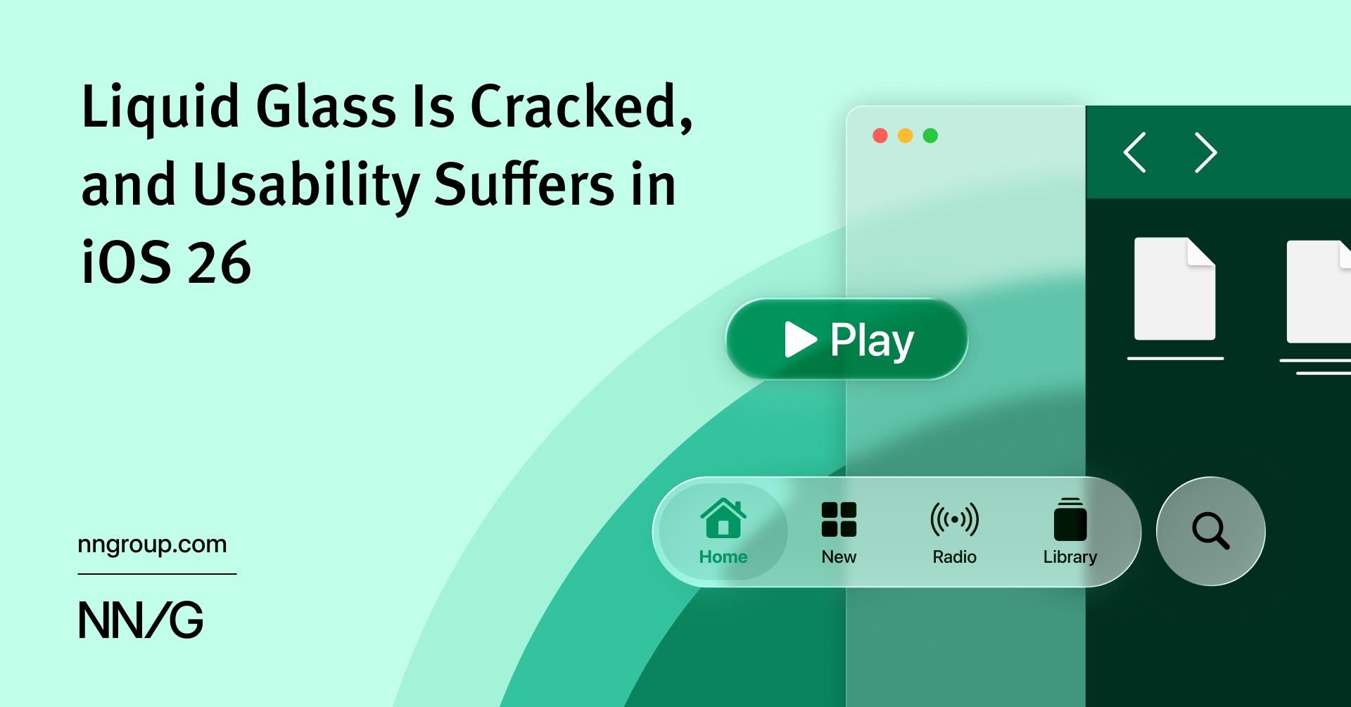
iOS 26’s visual language obscures content instead of letting it take the spotlight. New (but not always better) design patterns replace established conventions.
That looks genuinely terrible… makes me even less likely to convert to iOS anytime soon
It is. It sucks. Apple is making the same mistake they made in iOS 7 by appointing their hardware designer to redesign their software UI. They’ll be stubborn about it for a while and then start backing off the design after a year or so. If Tim Cook retires anytime soon, that might give them the excuse to shake up the UI again sooner.
If I was a developer, I would not invest my time in redesigning my app for Liquid Glass. It’s likely you’re going to put in a bunch of effort just to make your app unusable, and then in a year or two Apple will ask you to redesign it again when Glass is abandoned.
There’s apparently a GitHub project to mostly disable it with minor breakage… The fact this is even necessary is sad. The text on text example made me mad to look at 🤣