
- cross-posted to:
- hackernews@lemmy.bestiver.se
- cross-posted to:
- hackernews@lemmy.bestiver.se
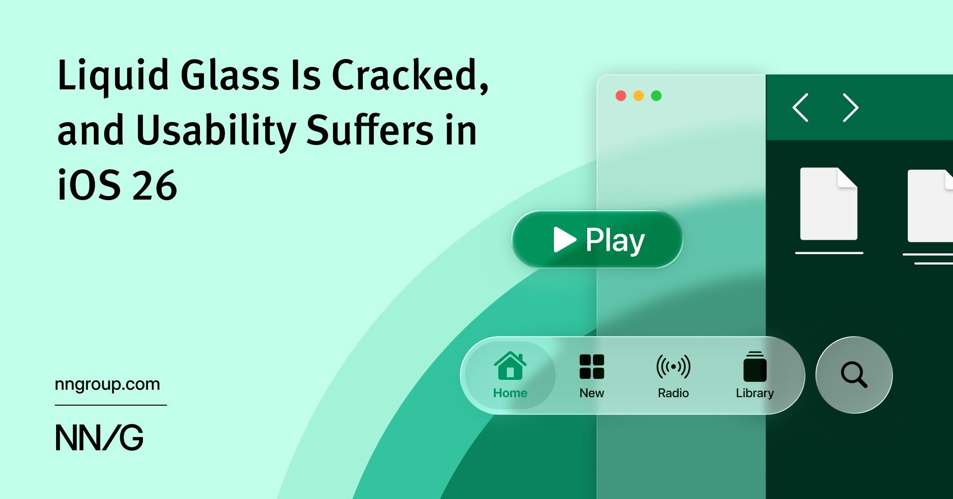
iOS 26’s visual language obscures content instead of letting it take the spotlight. New (but not always better) design patterns replace established conventions.
I quite like Liquid Ass (and I’m not afraid to call it by its actual name) but I don’t think it’s necessary to be glassy to accomplish what it does.
I’m hoping a future revision lets us theme it. Clear glass, frosted glass, brushed aluminium (or “liquid metal” if you prefer), etc.
I’ll be back…