
- cross-posted to:
- hackernews@lemmy.bestiver.se
- cross-posted to:
- hackernews@lemmy.bestiver.se
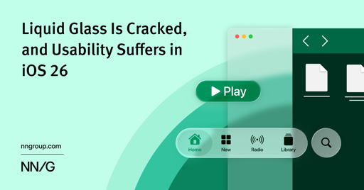
iOS 26’s visual language obscures content instead of letting it take the spotlight. New (but not always better) design patterns replace established conventions.
I’ve found the experience to just be buggy.
My keyboard shifts like 5 pixels to the left every time it opens.
I see all kinds of faults that weren’t there before popping up in analytics. For apps I don’t even use.
The design is inconsistent. Some places are glassy, some aren’t.