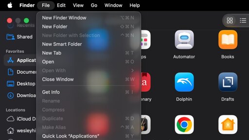
macOS Tahoe threw an icon on every menu item, making them impossible to distinguish at a glance. macOS Golden Gate has rectified that design taboo with blessedly iconless menus.
Having every single menu entry with an icon meant that Apple and everyone else had to create a unique icons where no established metaphors existed. If you were asked what those icons stand for without text you’d never guess which means it’s just unnecessary clutter. IIRC old Apple Human Interface Guidelines discouraged this type of design.

I’m surprised this bugged people. To be honest, I never noticed it but maybe slightly prefer it?
Having every single menu entry with an icon meant that Apple and everyone else had to create a unique icons where no established metaphors existed. If you were asked what those icons stand for without text you’d never guess which means it’s just unnecessary clutter. IIRC old Apple Human Interface Guidelines discouraged this type of design.
edit:
HIG is now updated back to how it was