
You must log in or register to comment.
Learned about this from dwarf fortress.
That was my immediate thought.
Geotech class was great for a bunch of graphs that made you go WTF in what they were trying to show in a way that made sense visually.
The lab was really fun, though.
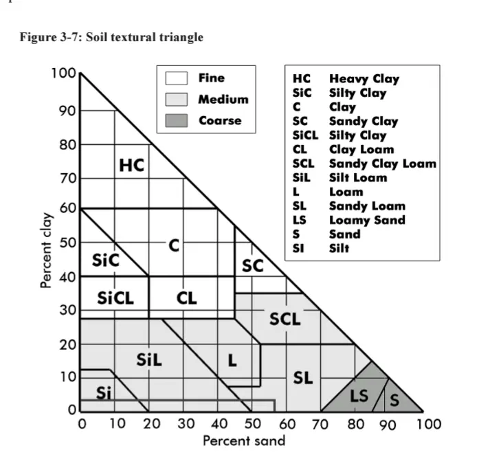
How come clay isn’t 100% clay?
It has to do with classification of the soil type. Soils with high clay content function similarly in regard to the soil chemistry and in most fields: hydraulic flow. Soils with such a clay component to be designated as just “Clay” will have consistent structure characteristics and act as a restrictive layer.
I don’t understand how to read the top one.
So the “a” in “loam” in the middle-bottom, it’s at an intersection of 3 lines. If I follow those lines to each side I see that loam is 60% clay, 40% silt, 60% sand, and 40% sand.
Ok, maybe I’m not supposed to follow the grey lines, but the cardinal directions? To the left, loam is 20% clay, to the right 80% silt, and below 50% sand.
The more I try to understand this chart the more confused I get.
Follow the orientation of the numbers. On the left, horizontal lines. On the bottom SE to NW lines (\) On the right, NE to SW lines (/)
So, loam is 20% clay, 40% sand, 40% silt.
deleted by creator
How can clay loam be 30% clay, 70% silt and 50% sand?
You’re reading the chart wrong, you have to follow the axis lines that match the angle of the numbers
I think I see what you mean, but really then you’re only ever looking at soil made up of two types. Clay loam could be 30 clay / 70 silt, or 60 clay / 40 sand, or 30 silt / 70 sand. That doesn’t make sense, because you could also, for example have a 30 clay / 70 silt in the sandy clay loam or silty clay loam regions - the 3rd thing is supposed to tell you where along the line you stop, yet whenever you do that you have 3 percentages that add up to more than 100%.
Maybe you wouldn’t call it 50% sand, and instead pick one of the sand diagonals to get a point in the clay loam region, but no matter how I look at it the percentages don’t add up.
No I think you’re still misunderstanding. For example, here I’ve chosen a random point in the clay loam section of the chart. We can follow the three lines to the numbers on the sides of the triangle and see that this clay loam would be made up of 30% clay, 30% silt, and 40% sand. You have to follow the lines that match the angle of the number on the side of the chart you are looking at.
You’re misinterpreting the lines. Each number only corresponds to the line perpendicular to the 100 point on their axis, and each line only corresponds to one number, not the 2 it looks like it connects to.
So for example, if you’re looking at the middle-top point of the “clay loam” category, right above the ‘l’, you get 30% sand/40% clay/30% silt.
*I whipped up a rough layout that better indicates which number goes to which line: https://files.catbox.moe/ljm6ih.png. Would be even better with the numbers aligned more precisely, but it’s not worth the effort for all that.


