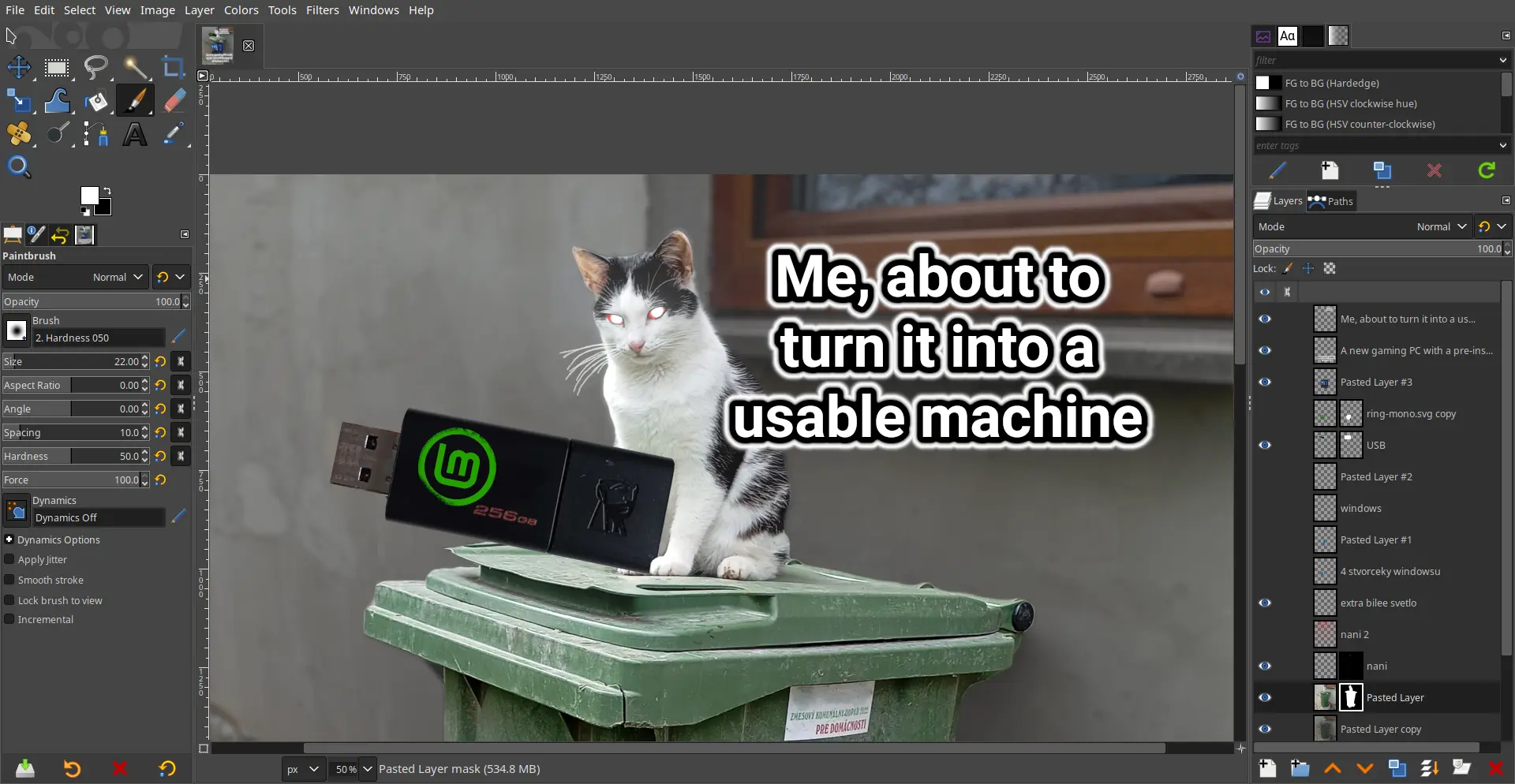
GIMP is great but it definitely needs its own Blender 3.0 moment where they just completely overhaul the UI.
I’ve used it as my primary raster app so I’m way used to it now, but I totally understand the people who just never even bother to learn it because they are so turned off by the absolutely bonkers design decisions.
The damn thing was written by a couple of College Students who had no experience with graphic arts and man does it show. The UI has been the number #1 complaint since the 1.0 release back in 1998; how it’s never been updated / overhauled is simply beyond me.
It looks good to me…
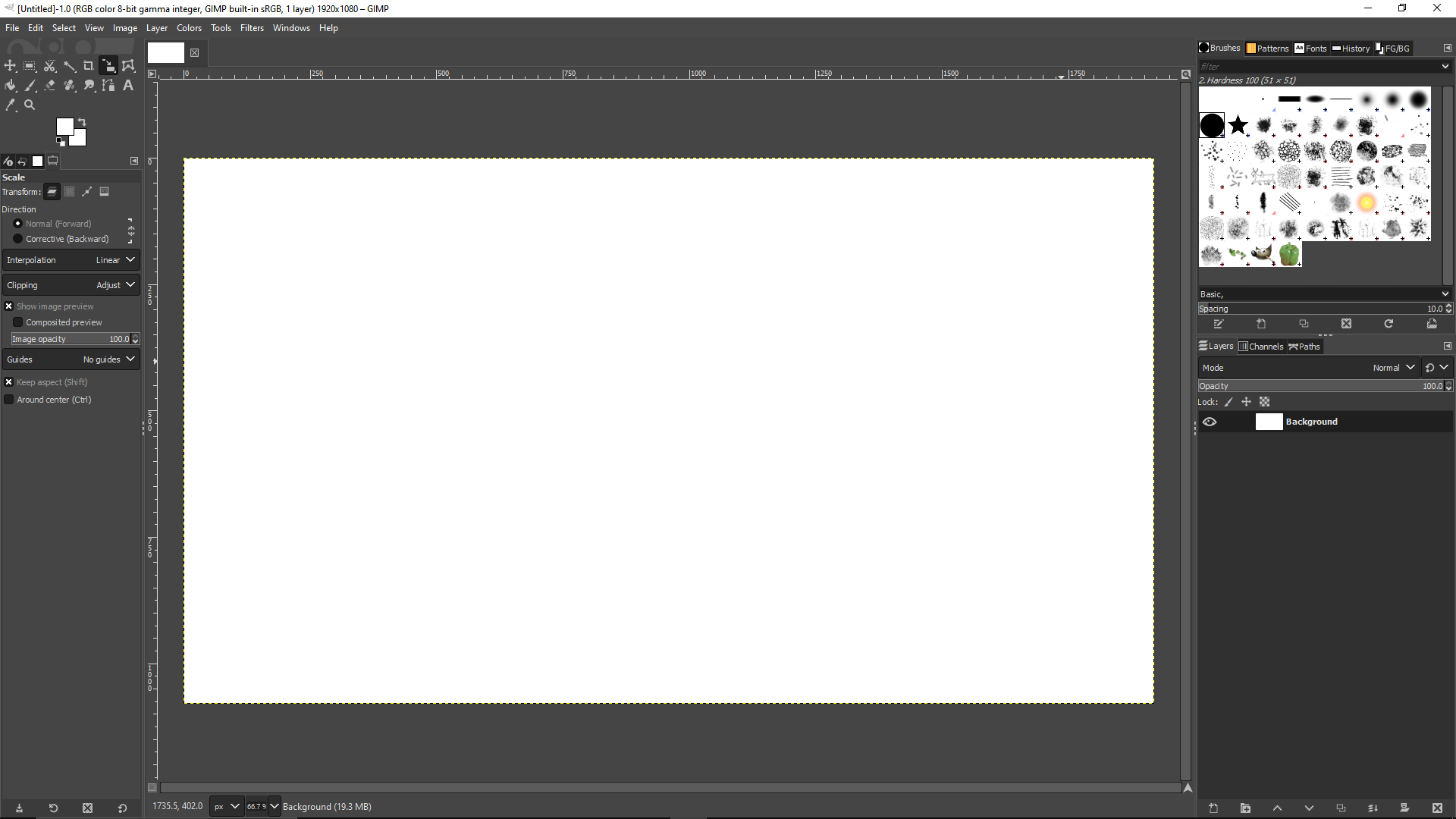
Why? Looks basically the same as photoshop, which everybody seems to love.
Among other things:
- monochrome color scheme prevents easy recognition of tools
- dozens and dozens of arcane options listed alongside super basic options
- weird sizing of buttons
- no help search, and no search that can associate synonyms where users don’t know what term to search for
- no inbuilt suggestions when user behaves strangely (eg. user is spamming the escape key, searching “deselect”, maybe suggest the deselect all hotkey?)
You can change the icon theme in the settings to a color one. That’s what I always do. The scaling can be changed as well.
May I ask what are some of the arcane options supposed to be?
How do you change scaling of buttons?
what are some of the arcane options supposed to be?
Not at PC for a few days but IIRC I was overwhelmed whenever going through any drop down menu.
Edit > Preferences > Interface > Icon Theme > Custom icon size
Newer versions of Photoshop have like 8 buttons and a toolbar which is terrible imo.
It is? How so?
Sorry for asking, I’ve used gimp forever, but I learned on photoshop. Its been a while since I switched, but I don’t remember having any real issues learning gimp
The thing is, it’s virtually useless for any real colour work, as it’s rotten from the core.
So it needs:
- Completely overhauled UI
- New name
- Complete rewrite of the core from bottom up.
I hate to say it, but it’s probably more efficient to start fresh.
But it did get a UI overhaul a few years back. Seems good enough
Yeah, I learned to do what I need to do and if they ever change the UI now, I will forever be stuck with the version prior to that. I am NOT relearning the interface.
Whilst Gimp is technically powerful, you can really tell it’s made by programmers. I cannot stand the UI and shortcut defaults, but maybe I’m damaged from having used Photoshop a couple times.
I have nevee used photo shop so idk if this will help as I have no point of reference, but you’re a legend for sharing the link anyway!
Thank you)
Krita exists and it’s way more robust than the abomination that is GIMP
They serve different functions
Man… I probably would be able to crack String theory before I’d be able to learn Gimp
I love Linux and have been using it religiously since 1998. But, hell for me would be to be seated in front of a PC for eternity, being forced to learn gimp and emacs.
Edit: I’ll know for sure that I’m in hell in a quadrillion years when I finally learn them (assuming i have the same adhd/dyslexia addled mind lol), and they then force me to use emacs to create new, more convoluted versions, of gimp and emacs.
Yeah I could never get into either. eMacs bindings feel odd at times, though some are pretty good. I wish I could get into Doom emacs like some others. And gimp…I know how to crop stuff and concatenate images, but that’s it
There’s a filter for that. Just make sure you click your equations right on the line or you’ll solve your notebook instead.
Sometime in the 90s:
“What are we gonna call it?”
"GNU Image Manipulation Program/GIMP. Huehuehuehue. trollface
“Yeah sure, whatever, it’s not like millions are going to end up using this thing.”
"Yeah sure, whatever, it’s not like millions are going to end up using this thing.”
Literally. GIMP started as homework back in 1995 for two College Programmers who didn’t want to write a compiler in scheme/lisp.
More like “huehuehue, millions are going to use this thing!”
Green is my pepper. 🫑🫑🫑
I prefer Krita
Great for drawing, but I would not edit images with it.
Thanks for this suggestion!
Isn’t Krita vector based?
Krita can do both, just like Gimp. Inkscape is vector only.
Krita is primarily a pixel based painting software. It’s more aligned with Photoshop.
make_meme_with_imagemagick.sh --text "How CLI memers look at GUI memers" --template twilight-snobs | upload_meme_to_lemmy.shYou can make the command line meming tool even more obscure:
echo "How CLI memers look at GUI memers" | convert -background transparent -fill black -font Liberation-Sans -pointsize 24 label:@- twilight-snobs.png -gravity center -composite jpeg:- | curl -F "file=@-;filename=meme.jpg" "$(sed -n 's/^UPLOAD_URL=//p' config.env)"What trickery is this?
Imagemagick is basically command-line GIMP. It’s very handy for doing server-side image processing, like scaling down profile pics or adding watermarks.
Lots of people who wanted to have photoshop for free salty about the menu layout being different in GIMP.
The gimp’s sleeping …
So I guess you have to wake up now …
The ONE program I miss from Windows is paint․net.
Have you tried Pinta?
I have not but I installed the flatpak. I’ll give it a go next time I need to make fun of someone. :p
It’s just not the same man.
At least for me, there wasn’t an equivalent replacement.
Try KolourPaint
Same. I used Paintdotnet for years and actually do miss it in Linux.
With recent Affinity acquisition by Canva, I wish more and more people try GIMP. But GIMP developer should match their UI layout to industry standard.
People from Photoshop, Affinity Photo, CSP, and other tools are confused with non vertical tool box.
But GIMP developer should match their UI layout to industry standard.
People have been asking for that since at least 1998 so I wouldn’t hold your breath waiting for it to happen.
Is this a joke? If someone can’t correlate a square box full of tools with a rectangular box full of tools then I’m surprised they managed to turn their computer on.
I mean that is basically what people’s UI complaints usually boil down to: things are in different places than where I’m used to.
I’m pretty sure majority of people will understand once they try GIMP, but first impression of familiarity do effect people’s retention.
It’s open source. Support the devs or help out yourself.
I do, but in a different way. I generally report bugs or triaging bugs.
Always found a bit weird the way gimp saves images. “Export” makes sense somehow but still feels weird, like if it didn’t want to hear about the thing you’ve created anymore ever.
It sounds like my use of ODF for text editing and then I export it to PDF for when I send it to others. One being the mold or sorts I make changes to and one being the end product.
Because when you press save, it saves the gimp project. It makes sense, because you’re working on a project in gimp, and that project has to be converted to a different format for use as an image.
It’s like expecting MS Word to print the page when you click save.
Every goddamn time I try to use GIMP I end up making a series of stupid minor errors because it uses non-standard keybosrd shortcuts (why is the default DESELECT hotkey not CTRL+D like in every other program with selection tools) or some other esoteric decision of hiding something in 3 menus or calling a tool by a different name to everyone else, then end up re-pirating Photoshop, not needing either for a while, deleting Photoshop cuz “well I’ll learn GIMP eventually”, repeat
Just get Krita already!
I recommend Lazpaint if you want something that’s significantly faster and lighter, though not as feature rich and nothing like Photoshop, interface wise.
I haven’t used Photoshop; learned basic photo editing in GIMP (as a poor student, I appreciated a powerful, free editor). So, no complaints about the UI from me. If anything, I’d probably removed about the Photoshop UI if I ever used it.
One thing that concerns me a little, however, is the third-party integration with Nik Collection. The second version, which I’m still using, was provided for free by Google. They later sold the software, and the new company commercialized it. I found it difficult to track down the v2 installer, so I’m now keeping it on multiple backups, in multiple locations, as one of my most treasured software possessions.
Gimp 3 is around the corner
It’s only been 20 years since Gimp 2 was released, why are we being so hasty?
Oh yeah… They’re porting it to gtk3…


