
You must log in or # to comment.

Oh look, my grandparents PC circa 2005
I was in the hospital in 2015 and was talking to the person next to me. He realised I was in IT and as he turned his laptop to me he’s like I can’t seem to view websites anymore with toolbars up the wazoo. It was already a throwback even at that time
Edit: wording
My old motherboard’s driver disc from 2015 would install Google toolbar if you weren’t careful
Aaah the good old “next next next install” you open the browser some time later with a surprise toolbar
In ~2005 I was at a job that provided tech support to local hospitals. That’s the first time I saw this image and … It didn’t strike me as too unrealistic.
At that job I once spent seventeen minutes on the phone trying to help a nurse find the semicolon on her keyboard.
Times didn’t change! Anyone that provided any large scale tech support to the actual average person understands that tech is indistinguishable from magic to them
Banzai Buddy!
My neighbor intentionally installed that shit on his family PC when we were like 15.
A lot of people installed this shit. Because they’re visiting fuckmybeaniebabies.net and a popup is like “Install our spam bar for a chance to win herpes!” And they happily click ok.
A lot of people still do that, but it’s “Do you want your phone/computer to constantly nag you with browser notifications about our spam?” and they click “Yes!”
Ugh. Yeah, my mom intentionally allows push notifications from Amazon, Temu, tons of fast food chains, and a bunch of other sources on her phone. It goes off like every thirty seconds.
I don’t get push notifications unless it’s a text or a 2FA email. And for that matter, I don’t understand how people get so many emails or, if they start to, why they don’t unsubscribe from or block all the spam. I get an average of maybe 3 emails a week on my personal accounts.
I intentionally installed it on other people’s PCs…
See you in hell
*bonzi buddy
How’d you get a screenshot of my mom’s desktop as I found it when I’d be home from college, cir. 2003?
deleted by creator
You can take a sexy single there
I’ve seen this toolbar hell before. I’ve had to clean many a pc of this toolbar hell before.
I’d always have to do this crap to our old Sony VAIO desktop (that was mine, until I went to college and my mom took it over). Then my mom would get mad that I “messed up the computer” because I’d delete this crap and apparently she used it?
What’s that relevant xkcd about workflows? /shudder
Oh my Deity
Would you like some help with your search?
I feel like some of the old cluttered WoW UIs might be an example of maximalism, by trying to show as much information as possible.

Eve players: noooo… It’s not just a spreadsheet
Veteran WoW players: hmm… I can still see the actual gameplay, lemme add another stat display
And they still wiped.
To be fair, they only had a thirty-two point three three uh, repeating of course, percentage, of survival.
“RIGHT SIDE, MANY WHELPS!! HANDLE IT!!!”
At least I have chicken
-50 D.K.P.
🍑💳
One should always wipe. I tell my 6yo this all the time.
I can’t tell you how many fleet fights I literally disabled graphics and only had the overview and chat. Especially multiboxing, I might have one with graphics. Not necessary for most.
I don’t think I’ve met a single eve player who doesn’t proudly refer to it as a “spreadsheets in space” game XD
Eve online mentioned o7
I miss it sometimes. Then I remember, last time I played it, I didn’t have my original log ins and whatnot so had to start from the beginning and it took weeks to get to a level where I could do basic noob stuff without dying right away. I then spent like 18 months of just training skills, I’d log in, fill the queue, log out, log back in a week or so later and fill the queue again. After nearly two years of doing that I just gave up :D
But I still miss it. But I also miss my abusive ex.
The 15 FPS indicator is the icing on the cake.
The standards we used to put up with…
The standards we used to put up with…
Back when games were measured by how enjoyable they were rather than a little number in the corner.
Or, in this case, but the amount of numbers in every corner 🙃
It’s not enjoyable to play at low fps though? I don’t get it
It was a different time, the novelty of the experience made up for the lower frame rate. A stable 30fps used to be considered good, and 15fps was fine for a game like WoW which didn’t really need to rely on buttery smooth gameplay.
The internet was also just a lot slower back then, too, so in one sense the framerate only needed to be as good as your ping, essentially.
This looks like when you first discover that your Linux desktop environment supports adding infinite taskbars
This takes me back.
WARNING: SEMEN LOW
This is what I would actually consider maximalist UI. OP’s is neither minimal or maximal, it’s just overstylized UI.
Healing back in the day was definitely like this.
I’m curious to know what it is like these days but not enough to give blizzard more money anymore.
Oh WarCraft stopped being a passion project a long time ago - Blizzard’s enshittification is pretty rampant.
If you get the itch to play WoW, 100% do so on a private server set to one of the earlier expansions.
Is that grid or decursive? Looks like they have duplicate frames?
Not sure. I used Healbot, which looks similar to what’s on screen, but it’s been so long I have no idea if it can be configured to look like that.
deleted by creator
I really wish I still had time for WoW… Sigh.
Mmmmm shadow bars
That’s not so bad. I have more than this, but with a larger screen you have more space.
So this is a healer. They barely need to see anything anyways.

what do you call someone with no arms or legs in a pool? . Bob
What do you call someone with no arms or legs on the floor in front of your door?
Matt.
What do you call a man with no arms and no legs on the barbeque grill?
Frank.
My wife has only begrudgingly allowed me to maintain a welcome mat that says “Hi! I’m Mat!”
Is this supposed to be on a farm? What’s going on outside that window?
IIRC, you could choose between a number of different themes.
But, yeah, rural America representation in technology was weirdly a thing in the 1990s.
I remember customizing this! What a throwback!

(Is there some open source media player with this kind of skins?)
Winamp has been open sourced https://github.com/alexfreud/winamp
Read their license. It does not meet the definition of open source.
Wow, they prohibit forking and distributing changes, that fucking blows.
Also, doesn’t look like it supports Linux natively, which is a shame.
XMMS is able to use Winamp skins. This one seems to be WMP, but that one copied the concept of crazy skins from Winamp.
deleted by creator
Qmmp might fit the bill, I apply old winamp skins to it for a nostalgia fix
ew windows media player
It’s time to bring back skeumorphism
That is probably what the image in the post is about, really.
It’s supposed to make the program more accessible for those who are not used to the concept of computer programs at all.
It will come back when all the big players are only offering cloud services, to ensure normies don’t demand that computing be allowed in the hands of everyone again. “It’s so easy to use! Why couldn’t those old PC things get it right? God those were terrible, I’m so glad we subscribe to ChatGPT for $80 a month, and those scary Muslim leftists get ion-cannoned when they have conversations about how they want life to be better instantly now.”
For those who are unfamiliar (like me): Skeumorph
Don’t please.
I remember these UIs and learning after many hours that one of the elements was clickable.
This is horrible design from a usability standpoint.

You say that, but that’s what Apple has been doing with Liquid Glass, and tons of people hate it, myself included
Liquid Glass is WindowsVistaMorphism done wrong not Skeuomorphism. Skeuomorphism requires the UI to at least approximate real life objects for each use case.
Like the old Notes app on the iPhone/iPad that looked like it was a yellow legal pad!
Liquid glass is not skeuomorphism, it’s just Windows Aero 20 years later. Simulating the realistic look of single material and using it for all the interface is quite the opposite of skeuomorphism. As such things don’t exist in real life. There were never music stereo players made entirely of glass. So they are not imitating anything that has ever existed.
Entirely glass no, largely transparent plastic yes.
A pretty good chance some luxury model might have been made for such a thing.
Even if not normally produced, some rich guy might have had it custom made.
How much liquid glass do you encounter in your daily life? Do you live in a kiln?
As an android user liquid glass is the only apple thing i’m envious of. Android looks boring af, a little playfulness doesn’t hurt
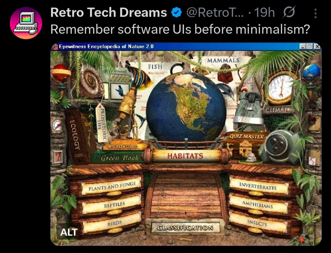
And you just know the globe rotates when you hover over Habitats, and the drawers pull out when you hover over those
I had this as a kid. It absolutely did all of those things, and the intro cutscene showed this menu as just one nook in a giant museum with other things to see. I had a few of their other games as well.
I can all but guarantee that a lot of the curiosity and enthusiasm for learning that I had as a kid was directly thanks to these edutainment games. Compared to my overwhelming adult apathy it really stands out.
And a little lizard runs across the bottom every once in a while! I had a Czech version, very painstakingly localized (but nothing beat The Way Things Work).
deleted by creator

Packard Bell Navigator. I really tried to make it work when I was a kid, but it was all style and not much function. I miss it, though. It was ambitious.
Seeing this helps me understand older sci-fi better, the ones where people access the computer as a virtual reality office which leads to other things. It makes sense that the authors would assume VR as the natural progression of a UI like this.
It seems like when personal computers were new they tried to replicate the familiar to ease new users in, but now that we’re all very used to them we’ve abandoned the concept almost entirely. I feel like we might be in the beginning of a trend back to it though, now that our internet connections and graphical abilities are more up to the task.

Yeah good riddance on that one
It’s telling that they had to brightly highlight the tab that’s actually active, because users definitely got lost otherwise.
This shit still exists on windows and I fucking hate it

Maximizing everything except accessibility.
Unless someone is incapable of reading, these labels are not color coded and listed under unique button structures to help them stand out. What part of this is inaccessible?
Yes, people who can’t read because they are blind would have accessibility issues…
It is pretty much guaranteed that the images did not have alt text for screen readers and were not set up to be tabbed through for someone who needs to use a keyboard and not a mouse because of dexterity issues. Then there is the problem that there isn’t a lot of contrast, the text is angled, it isn’t clear what is clickable and what isn’t, and a bunch of other stuff that are issues for people well beyond colorblindness.
While it could technically be created in a way for an alternate accessible way to interact they never really were. It takes a ton of work to make anything other than plain text accessible, and even that takes more work than just typing. It takes exponentially more work with something like this.
Nobody bothered to take that time unless they were sued. I am currently getting a state agency through a complete website redesign because we could not feasible make the old one accessible, and that is only happening because we were sued as a state agency is obligated to make their site accessible. The first things to go was shit like this.
I’ve been using this style of UI literally yesterday on a WinXP machine and every time you hovered the cursor over a button it played back what the button does, and some extra information. But yeah, mouse-only.
And that’s the fucking nightmare we seem to have at every web service now. Browsing is nigh impossible because everything will jump your cursor and autoplay.
5 downvotes in 7 minutes for a question? Smells like alt account brigading.
Anyway, especially with more modern accessibility tools and frameworks, why can’t a design like in the OP be accessible?
It was a loaded question and deserved downvoting.
It could still be done in an accessible way. Back when this style was popular though, accessibility on the web hadn’t advanced much. Now we have all kinds of tools to help
I’ve watched a blind person play FF14. Making a fun-looking static UI accessible is a piece of cake compared to that.
There was this while concept at the time that digital interfaces should mirror familiar physical interfaces in order to be easily understood by users, and it’s fascinating and honestly not without value.
Skeuomorphism
I can practically hear my external CD drive spinning up just looking at these. Makes me want to play a Sierra game real bad.
Back when all screens were more-or-less the same size and nothing ever had to scale. Your UI was the size it was, and if your screen was too big, too bad! You can either stretch it and deal with the pixelly mess, or squint your eyes to see the teeeny tiny program.
Most of these ran fullscreen and changed the resolution to 640x480 or 800x600, which most monitors supported. I had a widescreen LCD that would always stretch to fill, quite annoying…
“For VGA 640x480 256 colors”
Back when software had a soul…


